Maryland Department of Health (MDH)
The Maryland Department of Health (MDH) has an electronic Provider Management Module (PMM)
which is the one-stop shop for provider enrollment, reenrollment, revalidation, account updates and demographic changes to Medicaid.
In Layman's Terms ... people in the medical field (i.e. doctors, dentists, etc) want to be able to accept patients who are covered under Medicaid instead of private insurance. In order to do so, these medical providers have to sign up for that ability to accept these patients through the State of Maryland.
Getting Started ...
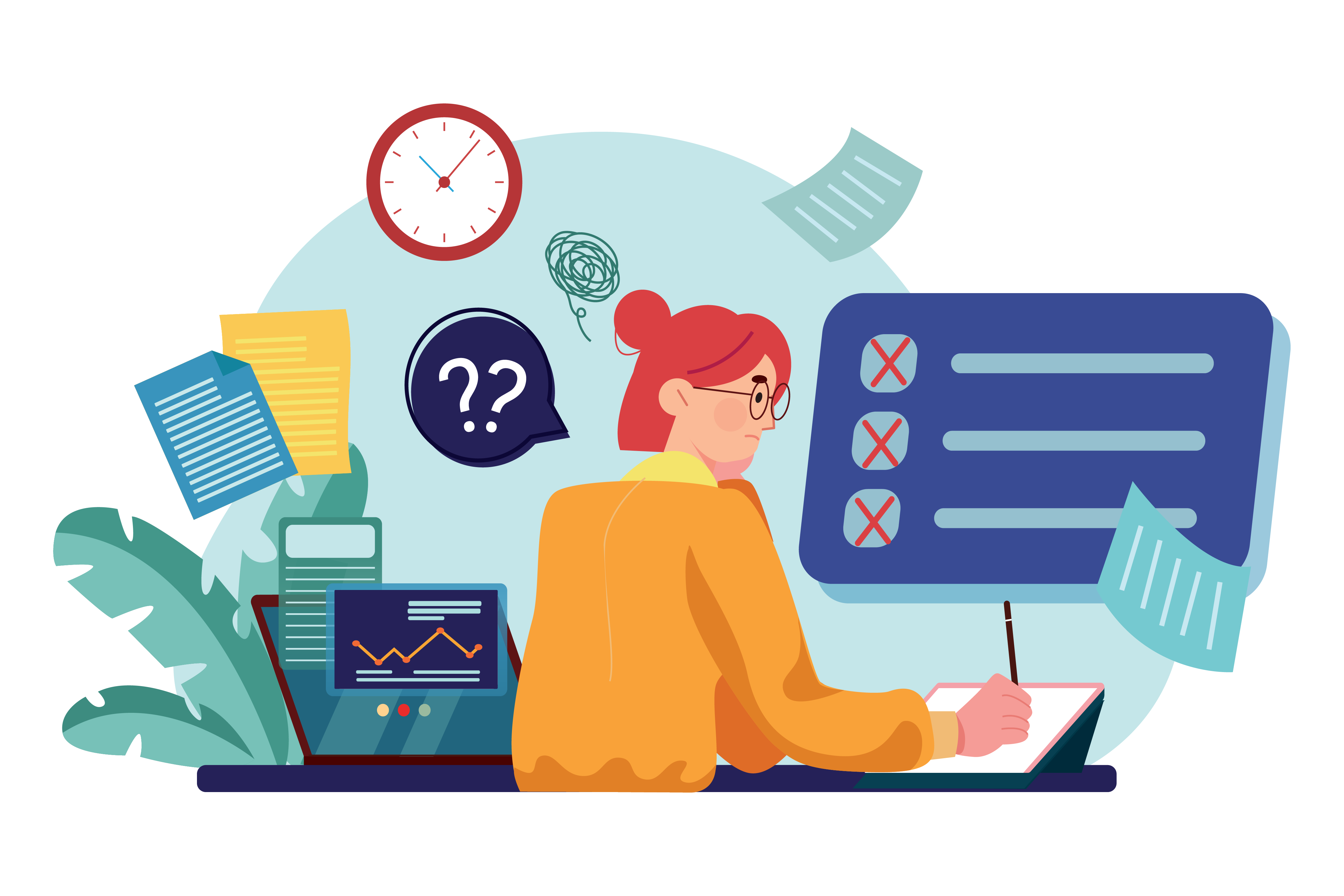
The Challenge
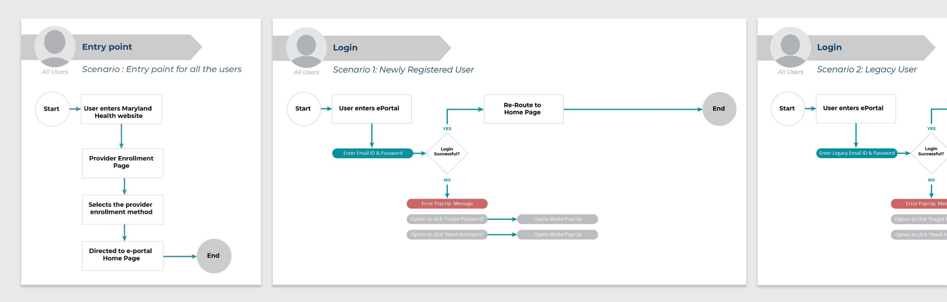
There are two sets of end users for this project: The MDH Staff (i.e. government workers who will own the product, receive all of the Medicaid applications, review them, deny or approve them, and serve as customer support), and "Providers" (i.e. Physicians, Dentists, Nurses, Office Managers, Credentialers, and hundreds of other types of Medical Provider types).
The existing system is severely prehistoric and was developed by a third party, leaving the MDH Staff desolate when they want to make updates. The chief complaint from providers is that registering and applying is very confusing, way too many steps, and entirely too "busy."
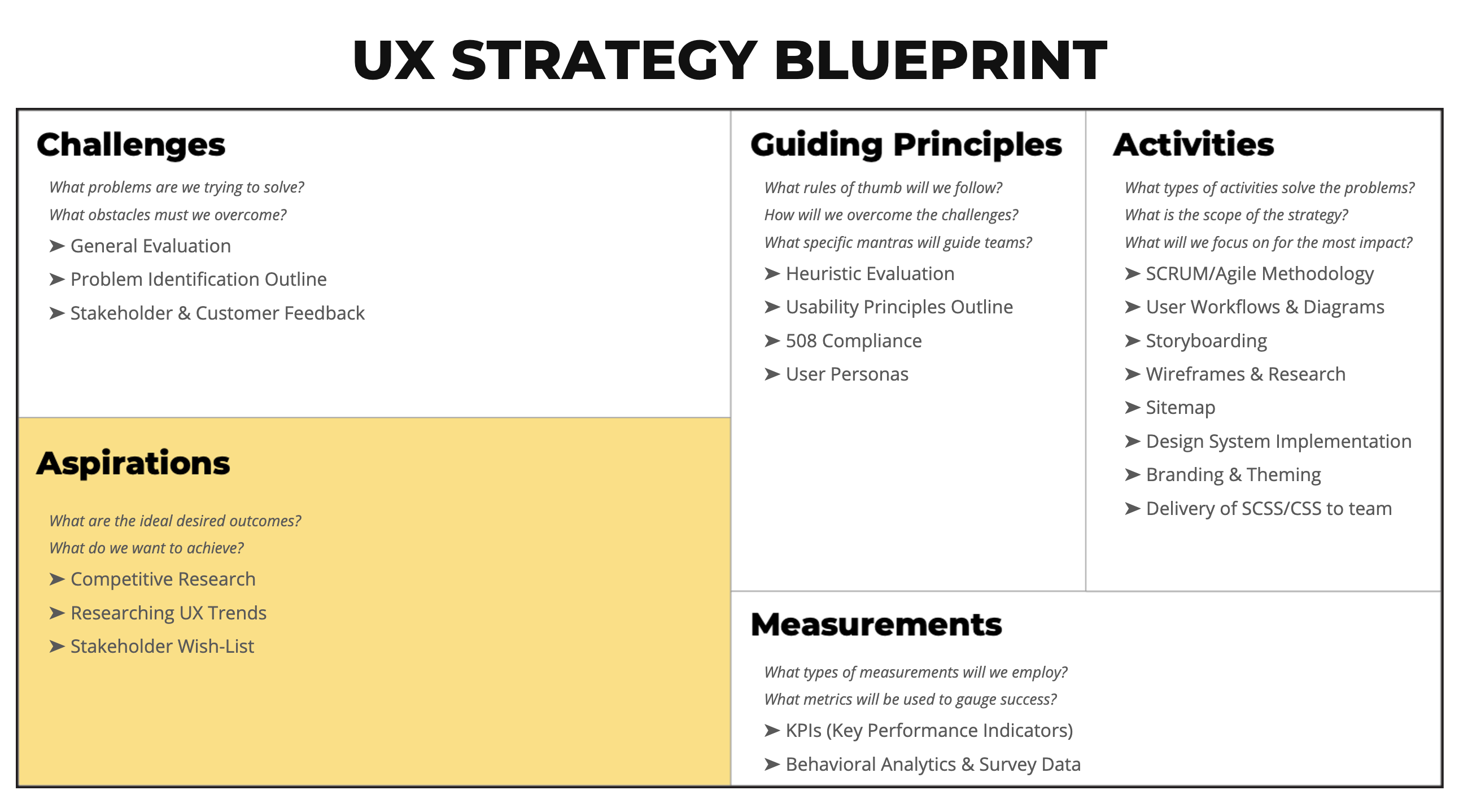
Constructing a Blueprint
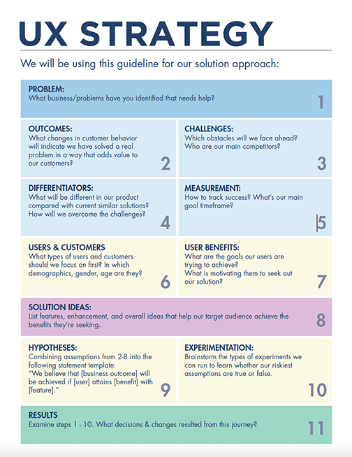
The purpose of this creating this UX Strategy Blueprint is to serve as a strategic planning process that helps to prioritize tasks and ensure our team isn't spending time and resources on non-essential work while developing our product. It takes into account the goals of the business, but also the needs of the consumers. A fully realized strategy also helps our stakeholders get a glimpse into our thought process and the reasons behind why we’re conducting tasks the way we’ve chosen to. It also includes a full understanding of the current state of things, aspirations for “the perfect outcome”, the development of a vision for future user experience and definitions (i.e. KPIs/metrics, design system, branding guidelines, etc).
Research & Heuristic Evaluation
What problems are we trying to solve? What obstacles must we overcome? In order to create a better product, we must first understand what the major challenges are. I helped to figure out these challenges by conducting the following:
- General & Heuristic Evaluations
- Stakeholder & Customer Feedback
- Problem Identification Outline
- The 5 "W"s (Who, What, When, Where, Why)
- Competitive Analysis
- Researching and Adhereing to WCAG/508 Compliance
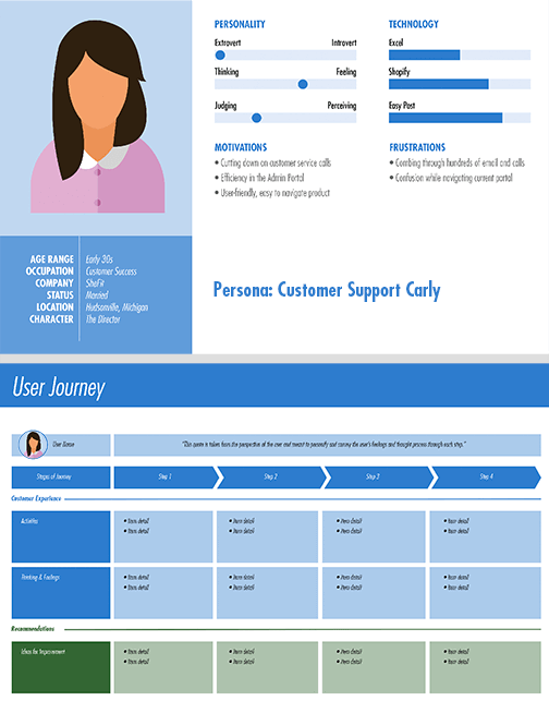
User Personas & Workflows
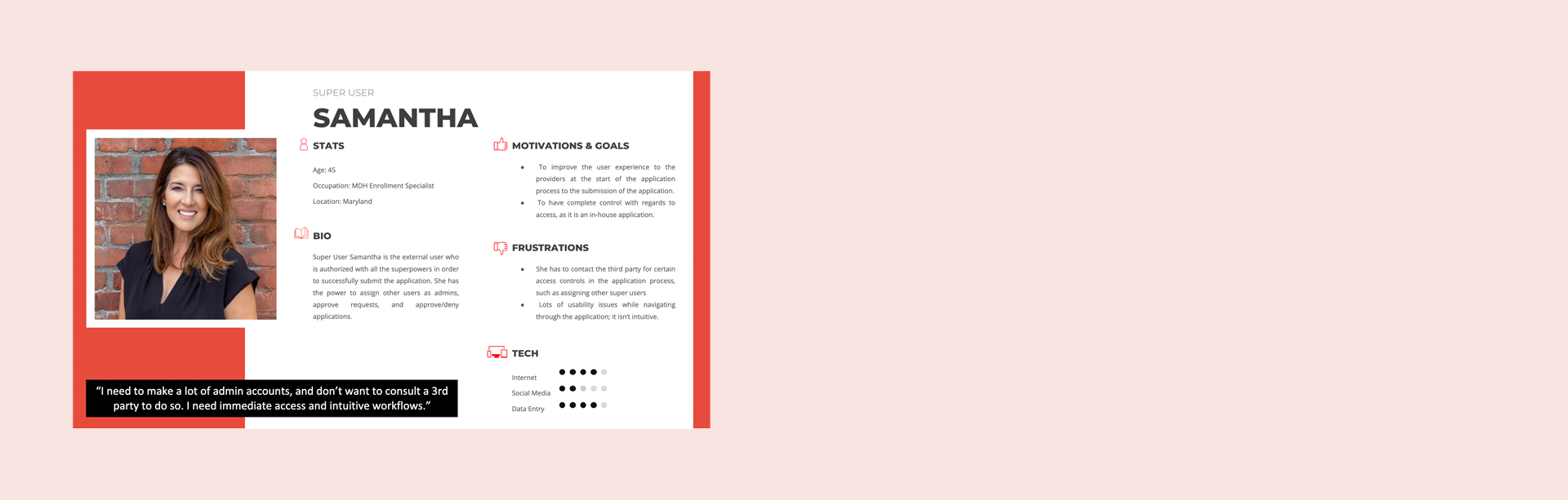
A User Persona is the fictional representation of our ideal user. A Persona is generally based on the research and incorporates the needs, goals, and observed behavior patterns of our target audience.
I was able to construct several personas after having sessions and walk-throughs with our MDH clients (i.e. those who intake the applications and provide customer service; they live and breathe this product). Each persona coupled with my compilation of extensive research helped to guide a path for workflows and sitemaps. Knowing the pain-points and frustrations of the end user are important in constructing site entry and exit, and how the application process should progress.
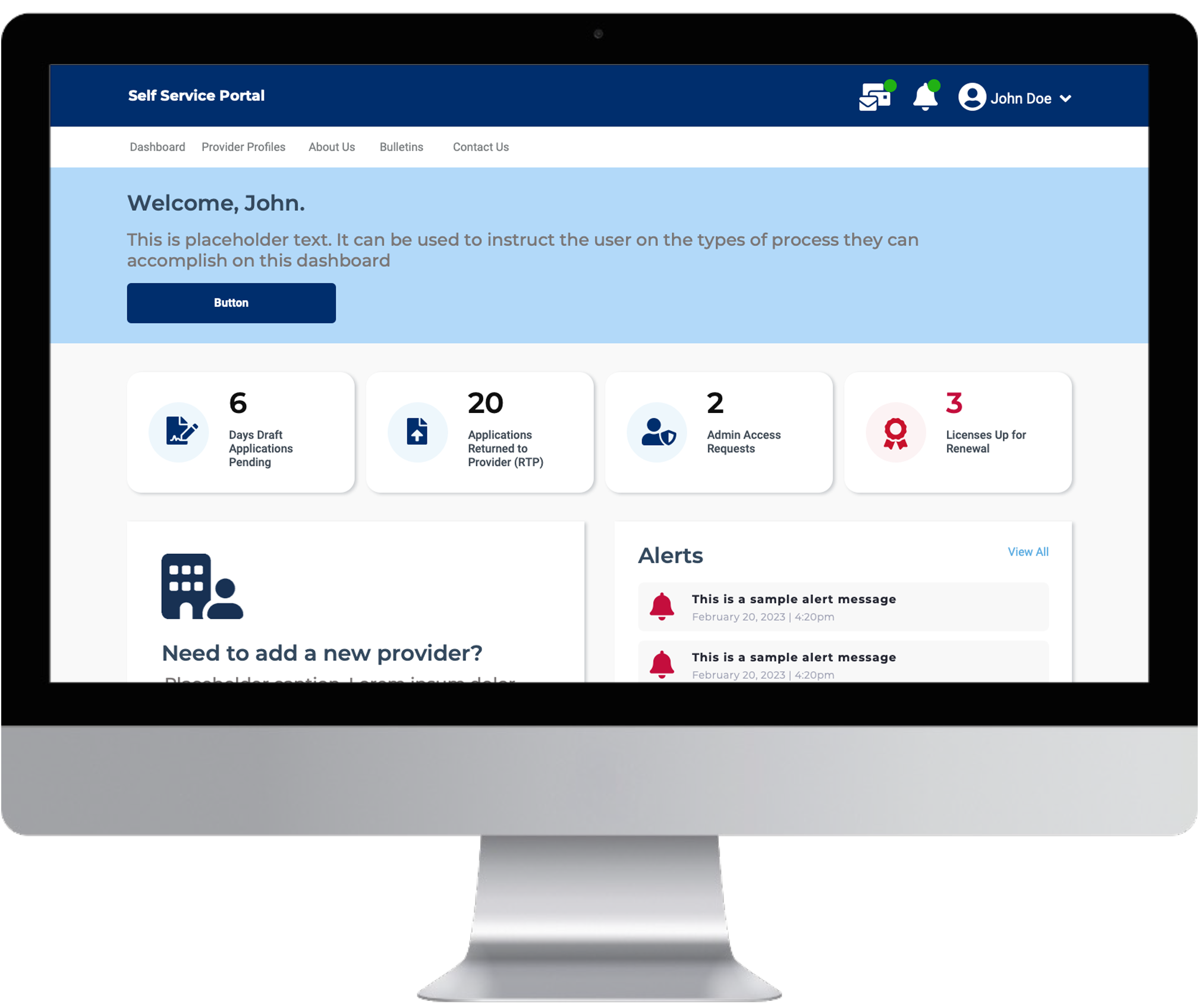
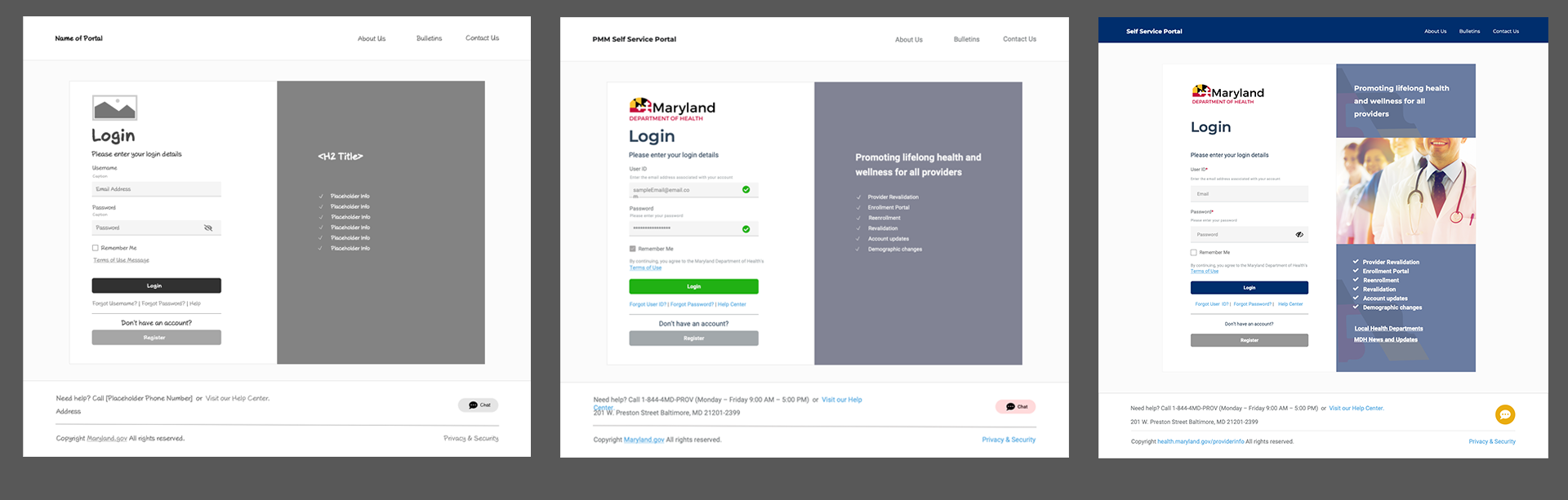
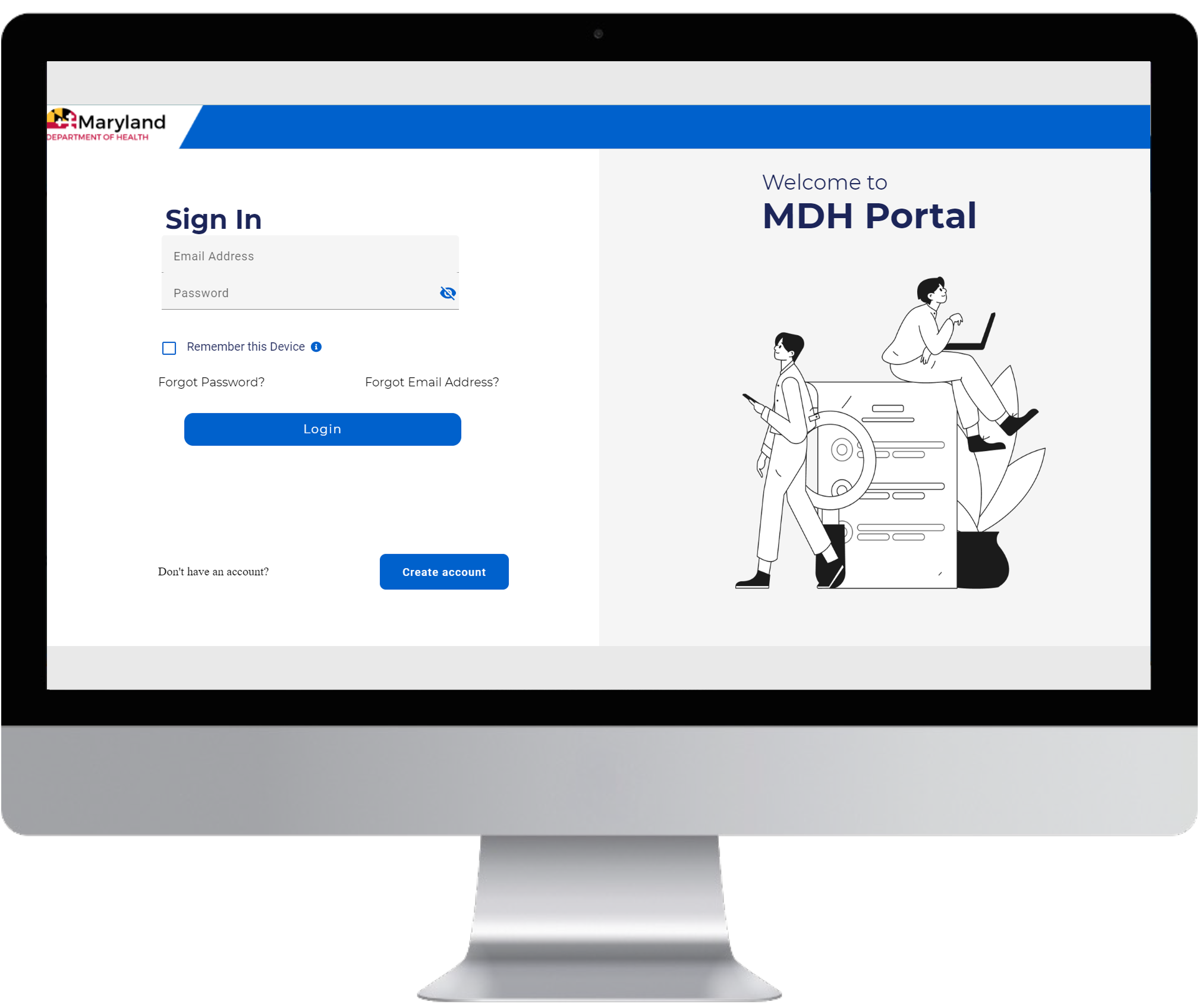
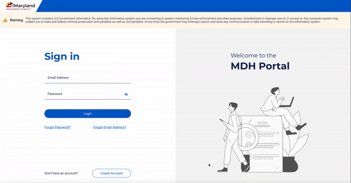
Design & Development
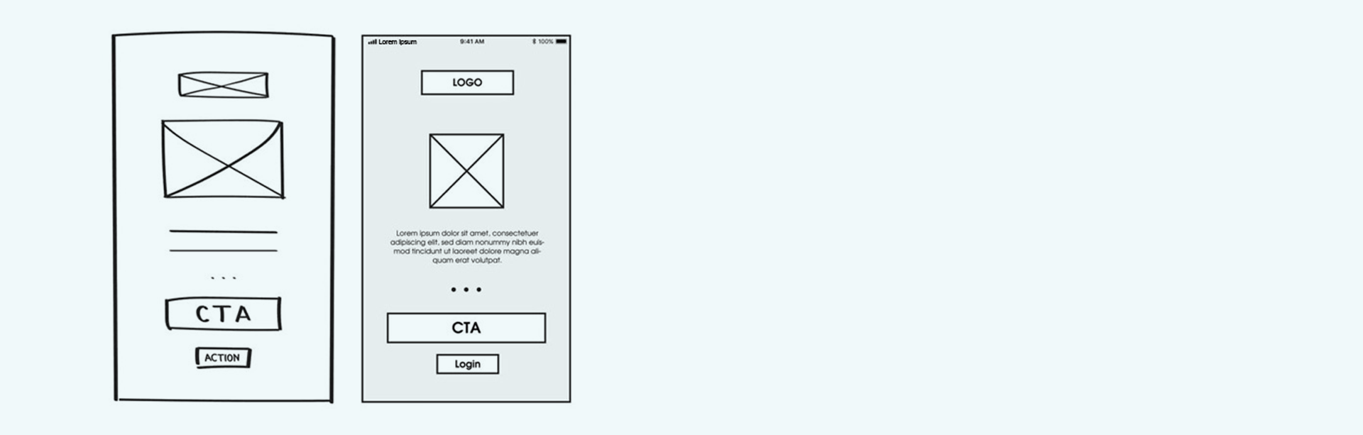
Now that thorough evaluations have been conducted, we can now take our ideas and translate them into wireframes. Phase one of this design process consisted of group discussions and “Low-Fidelity Wireframes” (black and white sketches) to determine the desired layout and feel of the new website. The next phase is “Medium Fidelity Wireframes” to breath a bit more life into the black and white sketches. The final wireframing stage is “High-Fidelity Wireframes” and simulations created in Figma.
Testing & 508 Compliance
User testing and Section 508 compliance is of critical importance. It's essential for ensuring that information and communication on websites are accessible to people with disabilities. This means making digital content usable by everyone, regardless of their abilities, and adhering to the standards outlined in Section 508 of the Rehabilitation Act.
For this project I conducted several iterations in Agile sprints to present to a team of end-users, and rand 508 Compliance testing using WAVE and NVDA.
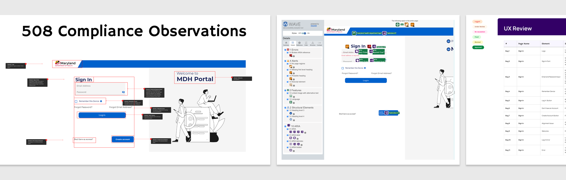
Current Project State
This project is being actively developed and is slated for release Fall of 2026. My present role is QA testing for 508 Compliance and making iterative change requests.
To view more of the extensive research,
View My (Modified) Case Study
... or if you would like to click and play around with the prototype,
View My Figma Link
Project Simulation
ReturnLogic
ReturnLogic is a returns management startup SAAS company. They offer software that gives
customers easy returns while automating workflows for customer service and warehouses.
ReturnLogic helps retailers make better business decisions that improve the customer
experience and drive bottom line growth.
In Layman's Terms ... if you (a customer) purchase something online and want to return the product, this company offers a third-party solution to make that return possible. But more than just making a return, ReturnLogic makes it possible to make an exchange, and thus, is more cost-effective for the business owner.
Getting started ...
Define
The Objective
Before embarking on a UX Strategy, I took some time to familiarize myself with the
company and what the "problem" was.
What were the user goals and business strategies?
When I first joined the company, ReturnLogic was relatively small; no more than 15
employees. There was no design department... which meant no branding guidelines, nor a
design system to assist with product and creative assets.
Customers had been poached by ReturnLogic's competitors, and it was my responsibility to
find out why.
Questions
- How do we prevent losing additional customers?
- How do we improve our product and make it scalable, and modern?
- How do we create ... the best product?
Research
A well designed strategy is founded on a bedrock of data-driven research. I conducted quantitative and qualitative research in order to help answer the "Who, What, When and How.
Plan
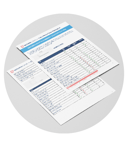
After closely examining the product myself for user experience discrepancies, and collecting user data from our Intercom customer service input, I then moved to hold focus groups with our target audience. I was able to collect substantial feedback that would spearhead upcoming design and development changes. Feedback included the following:
- Customers wanted the ability to create bundling and kitting options
- A responsive and mobile-friendly product
- Customers want the ability to customize their return centers to reflect their brand
- A product that's API driven to effectively collect user return data
Based on the research I obtained, I was then able to help define users personas, iron out user stories, scenarios and user flows.
Design
Now that I had a solid idea of how the product should flow, I was able to begin to
explore creative ideas.
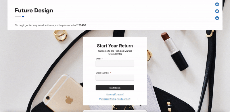
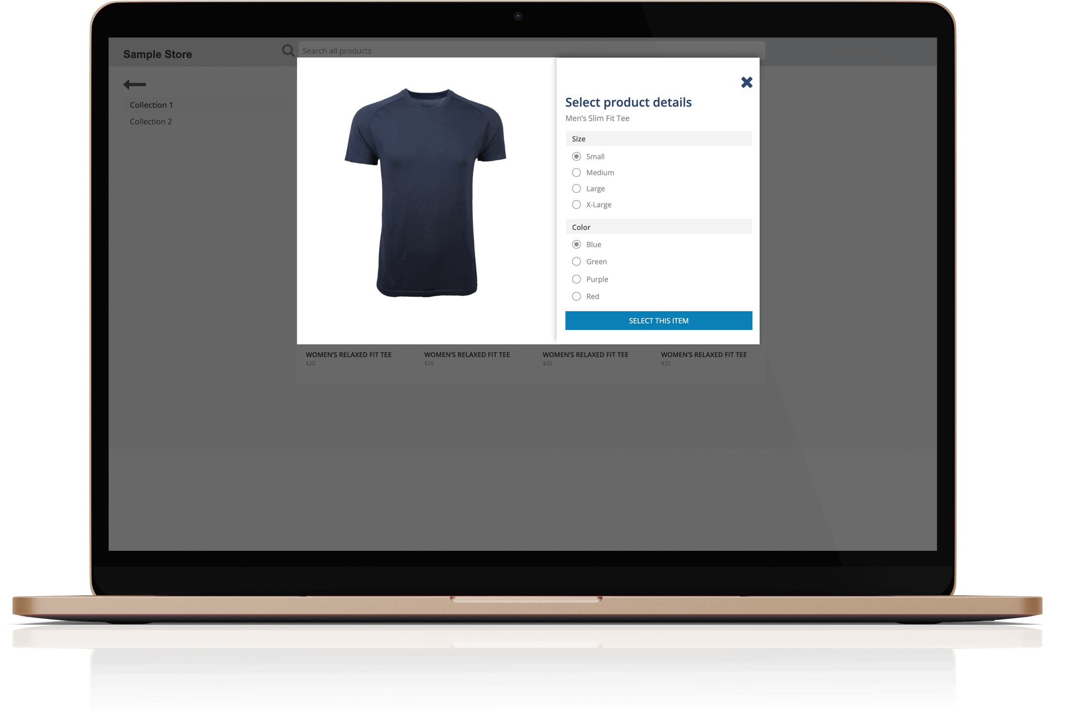
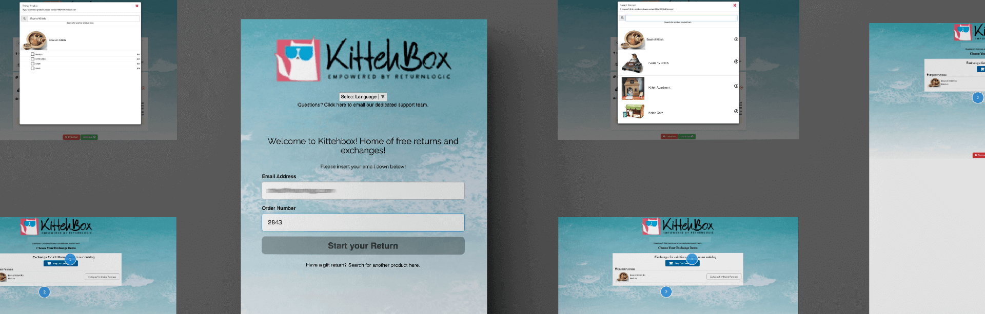
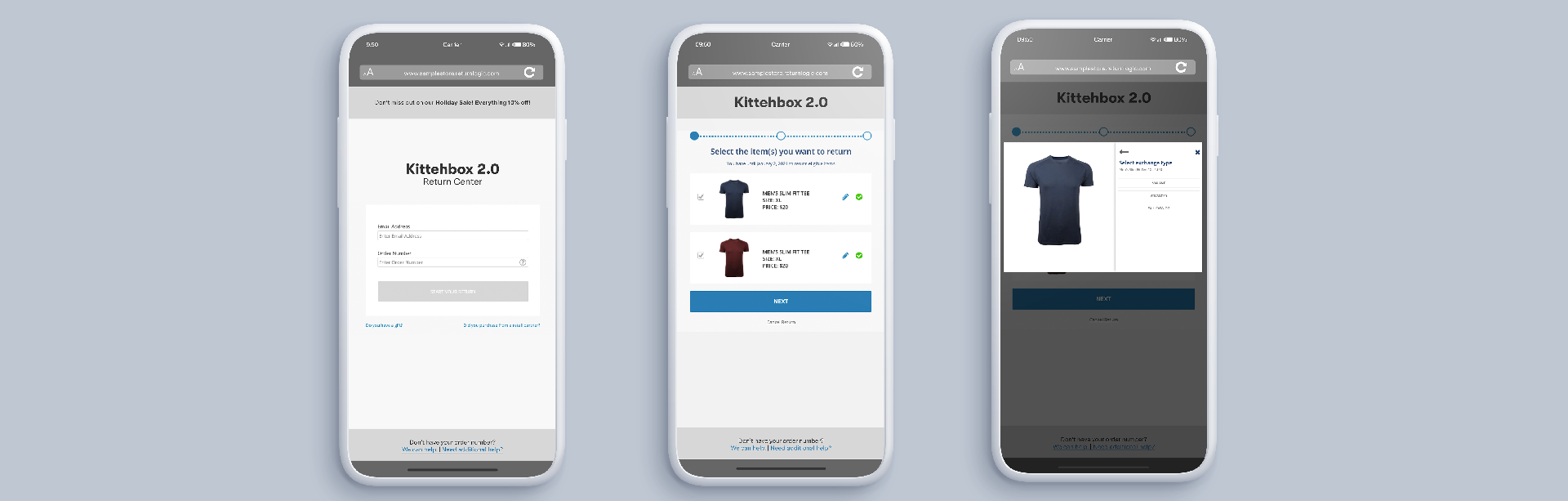
For testing, we created a user account under the name "Kittehbox" — a sample store that
sells cat paraphernalia, and... clothing (hey, no one said the fake business model had to make sense, lol).
The existing design was pretty outdated: there was an embedded background of seafoam
rolling onto an ocean shore, floating card components,
little to no padding between the child text/ parent containing elements,
inconsistency in textual hierarchy, and much more.
A new design would be a huge undertaking and best done in small bits. I wanted to ensure
that I'd have buy-in from all the necessary stakeholders.
I was able to navigate the remaining work with the following process ...
- The old fashion method of strictly pen to paper (I'm a sucker for sketching before hand)
- Creating a wireframe of the existing product workflow (to capture what components were already being utilized)
- Creating a low-fidelity wireframe (bare-bones, just to ensure that the structural layout has approved workflow)
- Creating a high-fidelity wireframe using Axure (the clickable wireframe behaves exactly as the eventual prototype)
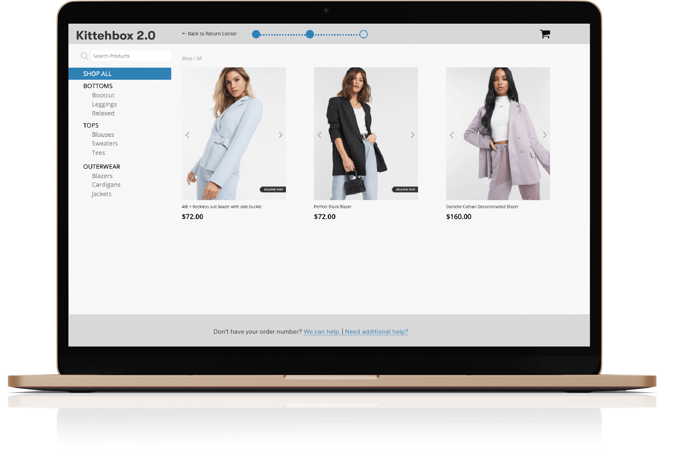
Now that the designs were approved, it was then time to create the design system and branding guidelines...
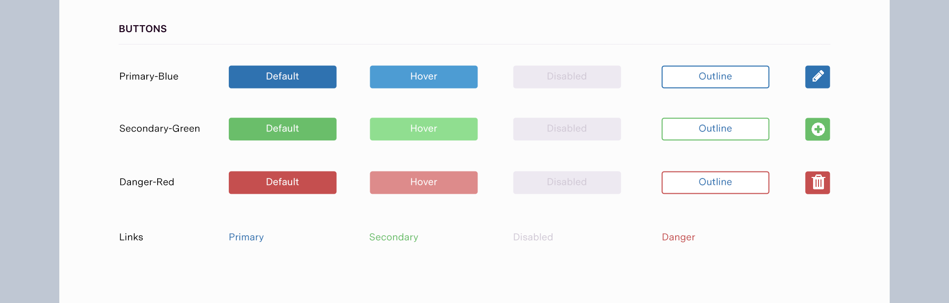
Scale
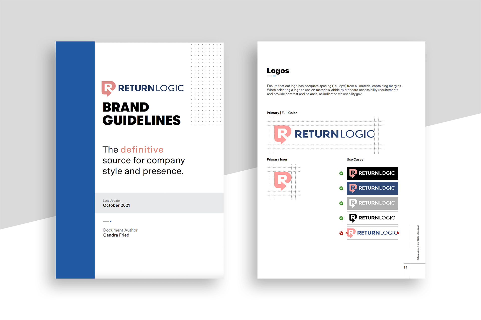
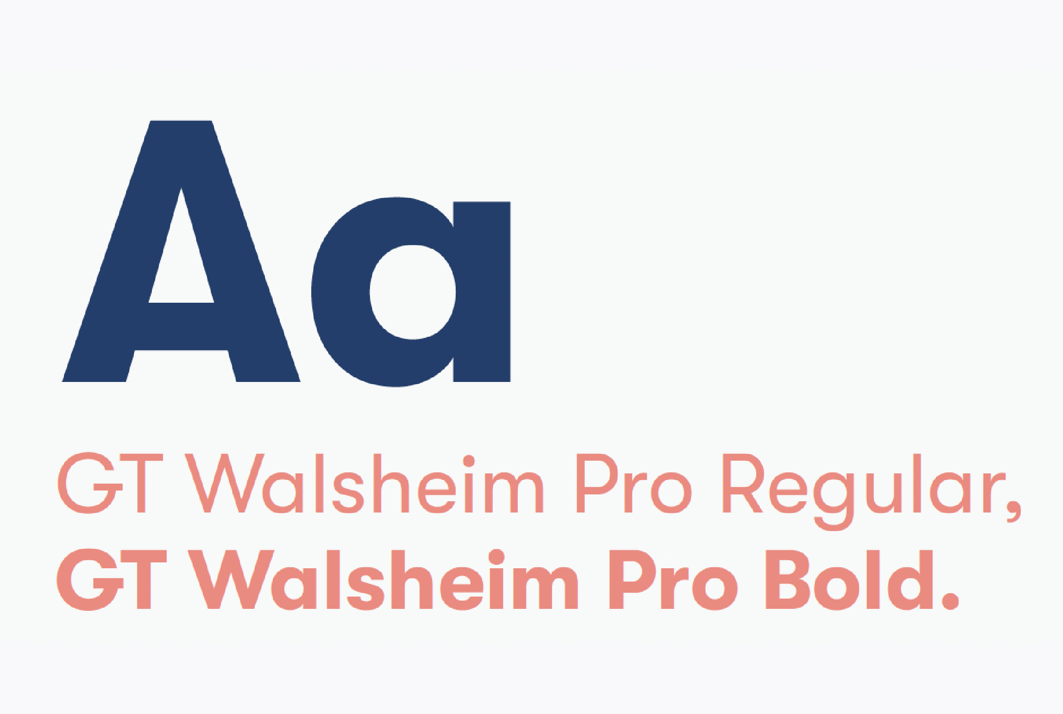
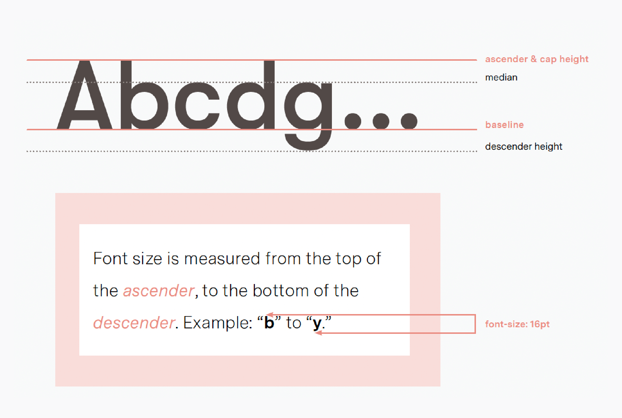
Reusable components are the key to building a scalable digital product. I wanted to create a user interface that is easy to maintain, and flexible. "Are we using the right imagery? Do we need a copywriter? What size should the buttons be and what color?" These were but a few of the important questions we needed to address and define. To be user-centric, I needed to ensure that our product was accessible, configurable, reusable, and component-based. To achieve this, I created global branding guidelines to be utilized within our internal product as well as customer-facing creative assets. These guidelines then carried over into the creation of a central component library to be used throughout future wireframes, prototypes, as our Angular-based UI.
RL-BLUE
HEX:#13416E
RL-BLUE
HEX:#8B2C23
RL-GRAY-OLIVE
HEX:#A1967C
RL-CONCRETE
HEX:#D6CECD
Current Project State
The new design has been a game changer among ReturnLogic customers, opening up several new possibilities within the business. It continues to be a work in progress, as new features are continuing to be rolled out. ReturnLogic continues to explore customer needs, the designs are growing along with the company, and becoming more modern.
To view more of the extensive research,
View My Case Study
... or if you would like to click and play around with the prototype,
View My Axure Prototype